The description of the Video Embed stack says “The embeds are automatically responsive”. The web page containing the stack responds correctly, but the stack itself does not. Using the default vimeo video (16x9 aspect ratio), it fits iPhone 8 (same aspect ratio), narrower iPads (4x3 ratio, narrower than the video), but the height overflows on iPhone X higher (19.5:9 aspect). The whole video doesn’t appear and the bottom controls are below the screen. See simulations for iPhone 8 & iPhone X.
In the latter case, the video should have resized to fill the height, not the width, so the full video would be visible.
How do I get this to happen?
Thanks,
Sri.
I’m not sure I’m following. The video, in your screenshots seems to have resized to match the device width, as expected. The controls are just out side of the view it would appear because you’re viewing it in the simulator in landscape mode. Perhaps I’m misunderstanding. Publish a test page for us and someone here on the forum can take a look.
Yes, I am viewing both devices in simulator in landscape mode. One of them fits the whole video, the other, you have to scroll.
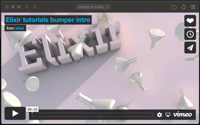
Yes, in both cases, it has resized to match the device width. When the video’s aspect ratio matches the device’s, we can see the entire video (including the play controls at the bottom) fill the screen out (first picture, iPhone 8, 16:9 aspect ratio, same as the video’s).
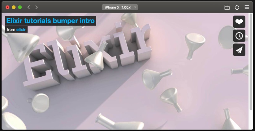
When the device’s aspect ratio is wider (iPhone X, 19.5:9), resizing to fit the width results in the height overflowing the screen and the bottom part of the video (e.g., player control) cannot be seen (second picture). You have to scroll down to see the lower portion of the video.
Expanding to fit the width works for other contents (text, etc.), but one would like the entire video to fill the screen. Of course, we can pad to reduce the width (and bring the entire height of the video on to the screen – in case of iPhone X and wider devices) but this would penalize the video display sizes on other devices.
It would be nice if the resizing automatically adjusted (in wider devices) to display the entire video (when full screen option is not supported on the video).
This is working as expected. Otherwise your video would be in a squashed aspect ratio. The current method is how it should work, and how it is designed to work.