I know - this question was already posted - but there was no solution / answer for this.
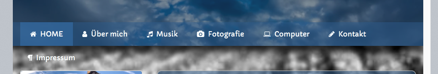
So I need to change the breakpoint from tablet to mobile earlier because I have the following issue as you can see on my picture of MegaMenu:
Hi,
thanks for your quick answer. I do not want to remove the icons - also I do not want to stack my menu - it is fine how it is. But if you could tell me how I can reduce the padding in MegaMenu - I would try this - I can’t find an option to do so.
Maybe you can’t then. Sorry, I was just throwing ideas out there, not grounded in a knowledge of the settings.
You have a Centre aligned menu? If so, I suspect the only way you’ll change the breakpoint is via css. If not, if you have a logo on the left, try reducing its width.
I asked about changing the breakpoint on the regular nav bar the other day via css, but nothing was forthcoming, do I suspect if you wish to go that route you’ll first need to discover the correct class, then it should just be easy enough to produce some css.
Being able to adjust the breakpoint via settings would be handy though. Perhaps in an update one day.
It is hard to glean much from just your small screenshot, without seeing more of the page. If you’d like to post a ZIP file containing your project file I can take a quick look at it in the morning when I’m back in the office.
@elixirgraphics
When I zip my project - it is still 250MB big.
Is there a way to upload it on a special space or what can I do?
A bigger screenshot from the whole page?
Can I reduce the padding in CSS for the buttons in MegaMenu? That would be the easiest way I think.
Forgive me, but is the problem not as evidenced in the pic? As the screen width reduces the menu items span two rows before hitting the breakpoint? I don’t think this is an isolated problem, I see it all the time.
Qiwi, just create a new project and drag one page to it, zip and upload.
I’m by no means expert on this, but as I’m here and as I hit the same issue the other day I thought I’d have a play.
I see the same thing with your project. The menu doesn’t break soon enough. It’s set to break at 48ems (about 769px in this case) but needs to break at about 60ems.
In Chrome Inspect I can get it to work, I change the 48 in the following css to 60 and bingo, but I can’t translate that to a snippet for you. I’m sure if can be done, just needs someone smarter than me to do it. Or, perhaps Adam has a better solution.
The only way I got it to work as expected is by reducing the font size, but it’s not really ideal as you need to go down to 12px.
The standard Bootstrap4 medium breakpoint of 768px is used in Foundry for mobile. If you need the mobile to show at 769 then in your case outlined above, a tiny reduction in font size or spacing will reduce the Nav width and then work.
Alternatively you could remove the logo and or branding text (or use a smaller branding text) and then use a Visibility stack with 2 or 3 fully adjustable breakpoints and us different configurations of Nav Bar in each visibility slot.
I would love to see more collapse control in Nav Bar with ideally a user defined breakpoint implemented exactly like that other one:)
Morning Gary. In the project above the mobile menu needs to kick in around 900px, I had to set the font to 12 before it would all fit at the pre-defined break, and it was tiny. I got it working in Inspect, but buggered if I can translate that to the project (I’m crap at most CSS at the best of times!)
There is no logo or banding.
Where is the restriction to a user-defined breakpoint: At the Bootstrap level or Foundry?
Aha! That linked page makes the css I was looking at when playing with the above project make more sense.
Be cool if Adam can introduce even those selectable break points into the nav stacks.
You know your css, is it even possible to change the breakpoints with some css snippets? Or, are they too embedded in the core code, so to speak?
EDIT: What version of Bootstrap is Foundry based on? Guessing the last as 4 is only just out innit? Unless a beta was used? (I’m not entirely sure what I’m talking about here!)
Hi @qiwi – this is indeed a case of too much and / or too large content for a horizontal navigation. Even if the breakpoints were different in Bootstrap, you’d still be running into this same problem as navigation items are getting hidden during the fluid sections of the navigation bar’s collapse.
As @webdeersign suggested above – you have some options. Reduce the number of navigation items in the main top-tier of your navigation, reduce or remove the branding from the navigation bar, make some of your top-tier navigation items into child items, etc.
There’s only so much that will physically fit within a horizontal navigation bar – especially when you’re talking about responsive navigation. You’ll need to make some adjustments to the amount of content you’re trying to put into the navigation bar.
Adjustable breakpoints is not something that will be introduced into Foundry.
Foundry is based on an early version of BootStrap 4. I have made many of code corrections and customizations to it myself though, so it is a one-off product.
There is a lot to be said for this approach I guess. have in the past pushed things too far, to the point where you don’t actually have a desktop menu, on almost all but the biggest screens the menu was compacted. With screen sizes getting bigger though there might be an argument for shifting the breakpoint up a bit, that’s a moot point though.
The big advantage of sticking to a smaller breakpoint though is it forces the maker of the site to really focus on what’s important to the user. Less is more is often the case when it comes to clean navigation.
To the OP… If you really need all those top level menu items considering switching to a permanently compacted mobile menu, like Nav overlay. Just an idea.
Instead of completely adjustable breakpoints, would you consider a user-selectable breakpoint for the nav banner?
For example, I tend to run across the opposite of the issue here. Sites with only a few main navigation menu items which get the mobile nav menu button in tablet mode. There’s plenty of room for them, and it would make navigation easier if they saw the regular nav bar in tablet mode instead of the menu button.
Currently, the nav menu switches to the menu button for tablet and below. If we could choose (Mobile, Tablet, Desktop) as the nav breakpoint, it would help when there are either too few or too many nav elements at one of the breaks. In my case, I would choose “mobile”, in the OP’s (or Steve’s) case, they could choose “desktop” to collapse it at a wider point.
This would be pretty simple for the user to understand.
It has nothing to do with understandability in this case. While what you’re suggesting seems simple enough in a block of text, it unfortunately does not work that way. The breakpoints are what they are purposefully. Allowing them to be adjusted, especially on a per-stack basis, will lead to the compatibility of breakpoints between different stacks not working as they should.
Just to be clear, I’m not talking about being able to adjust the breakpoints. I envisioned picking one of the other standard breakpoints used in Foundry (Mobile, Table, Desktop) for when nav bar collapses. In doing so, is there really any incompatibilities between the breakpoints?
I understand exactly what you’re suggesting. That is even more of a problem, believe it or not, than it would be to to have user defined, overarching breakpoint values (of which would also be a problem).
Hi - I understand that you can’t allow users to tweak them, but can you let us know what the exact break points are in Nav Bar? I need to make sure my custom css is compatible. Also, are the break points the same for Nav Bar and for Margins? I seem to be experiencing some inconsistencies. Thanks