Hi,
I’m creating a new website using Foundry and Carpenter as a base.
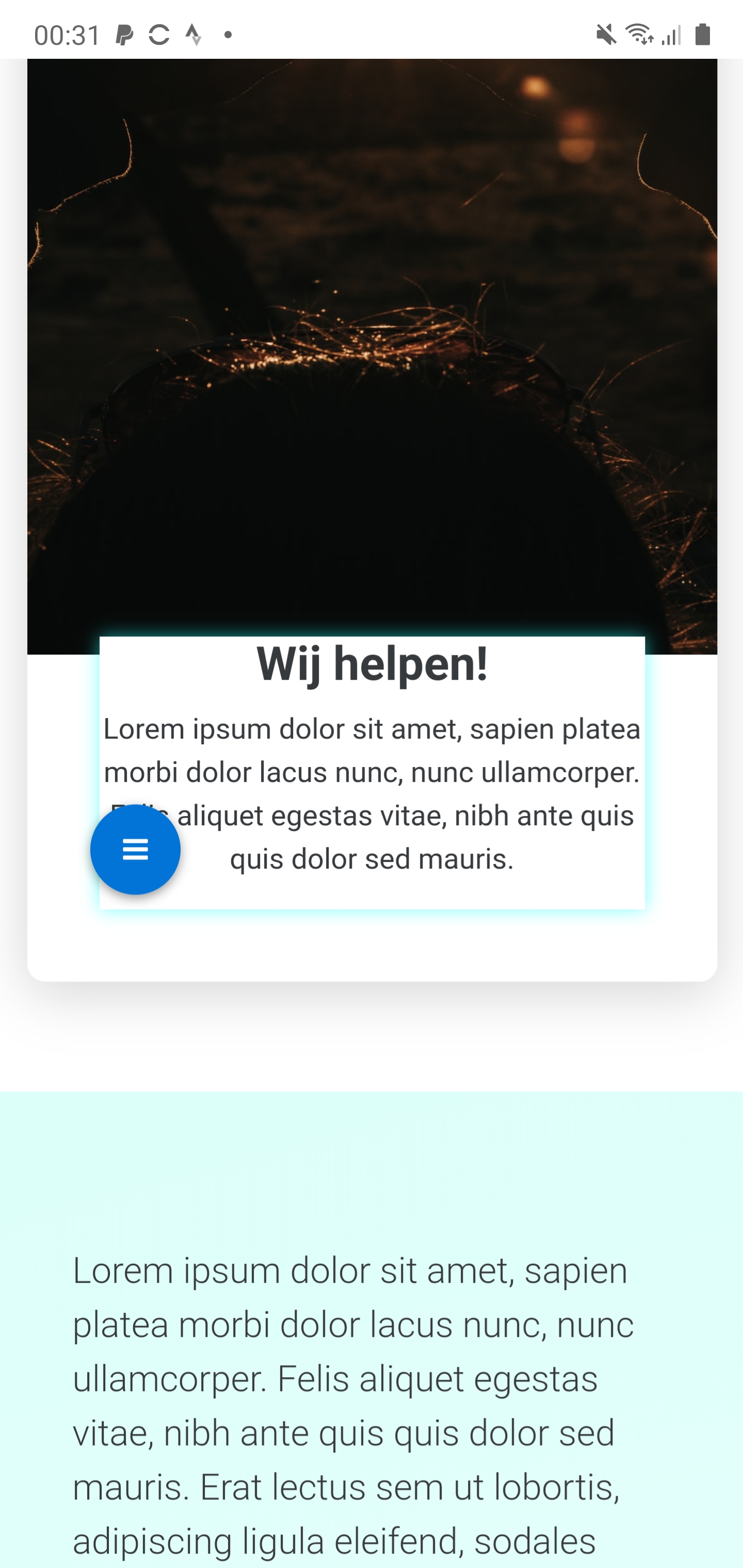
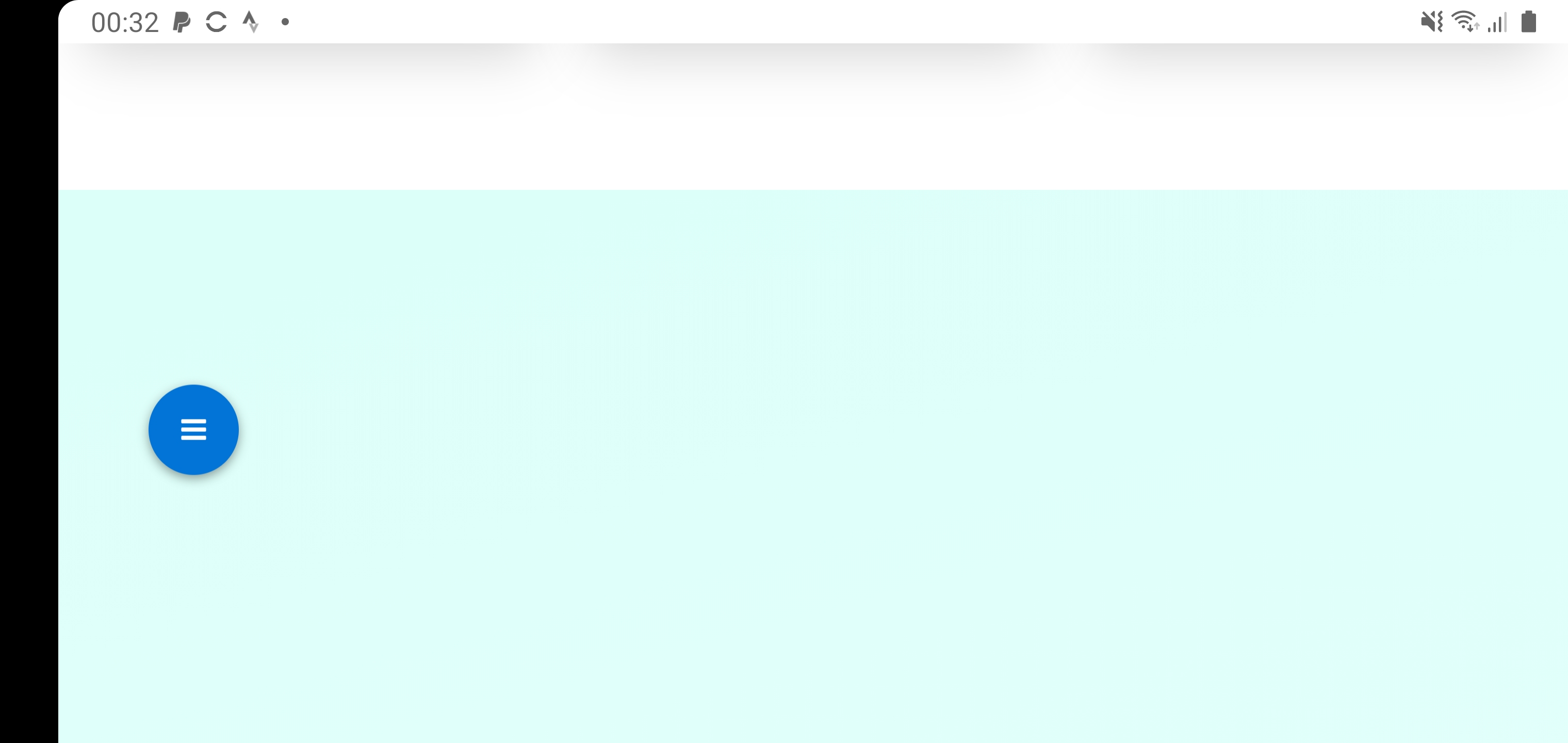
I noticed that, when using Overlap, I get a LOT of white space when switching to landscape on my Android device (using Chrome).
Any clue??
Site can be accessed here btw development area
Cheers, Peter
Fiddling and tweaking with the Unified settings (Top 50/150/150. Bottom 0/0/0) changed the behaviour.
So RTFM helped. But is this really the solution?
I embedded overlap btw in another overlap.
But even when I didn’t do this, it worked only as shown in the images.
I’m wondering, what makes the difference between Portrait and Landscape on Mobile (Android)??
There’s clearly a difference in behaviour, which can be seen in the distance between the sections (and the hight of the “Wij helpen” block)
In landscape orientation, depending on your device’s size, you may be hitting the next breakpoint up, which would be tablet. Does it appear that your tablet settings are being applied perhaps?
1 Like
Hi,
I’m using a Note10+, so a rather large device.
This might cause the issue. They don’t call it Phablet for nothing right?
Just to be sure I’m going to alter the settings later today (100 Phone, 200 Tablet or something) to see what happens.
Anyhow, after tweaking the Unified settings, I’m okay with the results already.
2 Likes
It indeed seems to be that my Note10+ ‘acts like’ a tablet in a way.
It works alright at the moment after fiddling a bit. I wouldn’t know how the design shows on smaller mobile devices, a small tablet like iPad mini, Galaxy Tab etc.
But we’ll see. Let’s close this one
1 Like