I purchased Teleporter to put some promotion into the sidebar on my homepage; however, nothing is appearing.
The thought of making a bunch of columns and getting everything in exactly the right place, each with the right background colours et al, is a rather complicated solution.
Any ideas?
Hi @brendaclews – Sidebars are something that is a part of a theme’s structure. There’s not a sidebar mechanism in Foundry because you’re building your page from the ground up in a modular fashion. In doing so you as the designer of the page would be creating the “sidebar” and it would be done in a fashion like you describe for the most part.
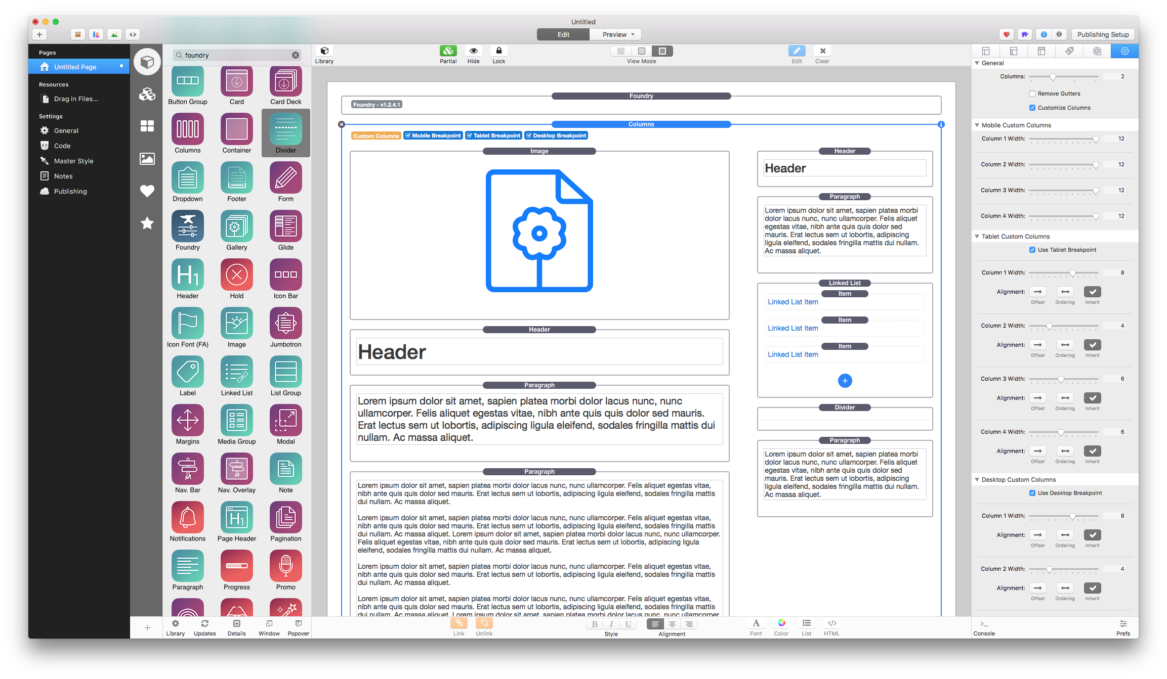
You could use a Columns stack, set to custom mode, with one column being wider than the other at the desktop and tablet breakpoints. Maybe something like so:
In this example I’ve created it to have one columns set to 8 units wide and the other to 4 units wide. This gives us a “main” content area and a “sidebar” content area.
Addendum: If you’d like to play around with this example project file you can see what I’ve described above: CustomColumnsExample.zip (170.6 KB)
Note that this is a very simple example. You’d want to build your own for your own purposes.
2 Likes
Hi Adam, I fully understand. Thank you for such a detailed and helpful response. Elixirgraphics is the best!
I have downloaded your project file - looks great!! I’m thinking maybe I could put a card in the ‘sidebar’ column and make it a different colour to the rest of the background of the site - and it would have a border, which would be nice.
Thinking here that there might be a need for a Sidebar Stack? Is it possible? I would buy for sure!
1 Like
I could put a card in the ‘sidebar’ column and make it a different colour to the rest of the background of the site - and it would have a border, which would be nice.
Definitely! The Card stack would be very nice for that.
Thinking here that there might be a need for a Sidebar Stack? Is it possible? I would buy for sure!
The Columns stack is a sidebar stack essentially. If I were building a theoretical sidebar stack it would have the same functionality as the Columns stack currently. Perhaps though I’m missing what you wish to do or what you’re looking for out of such a stack, but there’s nothing different in what the Columns stack is not and what I would create for something labeled as a “sidebar” stack. It is all just in a name.
The Card stack works great! I am having trouble with the columns, though. I need the Card stack to be white, which it is, and the background of the columns to be black, and the post to be in a grey box. Here’s a screen grab to show my difficulty. Any ideas?
You can color the background of just about any stack, for the most part. If the stack itself does not have its own background color controls you can use the built-in color controls from the Stacks plugin itself. I’ve tweaked the example I posted earlier to show an example of this: CustomColumnsExample 2.zip (647.8 KB)
Nothing is quite working - not getting a sense of ‘sidebar’ at all; rather, these items are in columns. I’ll have to change the whole look of the page for something to work, I guess. Anyway, thanks…
If you post a ZIP file containing the page you’re working on I will have a quick look at it.
Just an artist here - how do I make a ZIP file of a single page? Thanks
You can’t. You need to make a ZIP of the project file. I should have been more clear. I just will need you to either make a stripped down copy of the project file with just the page you’re having a problem with, or you’ll need to send the entire project file and be sure to point me to the page specifically.
The RapidWeaver project page is 6.9MB; the zip file 8.2MB. So I’ve split it into 3 files. Really, do I know what I am doing? No.
Unfortunately those are not working. If it is that large you have two options – make a project file with just one page that has the columns you’re working on, save that and ZIP it up, or use something like Dropbox to send it as a link.
Really, all I need is a project file with one page – the page you’re working on building columns for in your screenshot above – and I can work it up from there for you as an example.
Brenda: I would suggest making a duplicate of your RW file first. Then right-click on the project file (or control-click). In the pop-up dialog box you’ll then see an option to COMPRESS the file. This is the same thing as creating a zipped version. The resulting file will have an extension of zip.
If your project folder is 7 Mb the compressed version will probably be about 3 Mb (just a guess, but it will be noticeably smaller).
It’s the same process if you know how to copy your project, delete all other pages except for the problem page. Then compress and upload/send to Adam.
It’s crazy - my Mac is making a .zip file that is larger than the original! So I used Keka, and the same. It’s 1 pg and 7MB; the zip file is 8.2MB.
Hi Adam, I can send via DropBox or GoogleDrive, whatever works. Thanks.
That worked well. Thanks!
Just got this when I got into the office this morning and worked up two quick samples. I’ve removed everything else from the page except where I’ve built out the columns. You were using a Card Deck for your main content, which isn’t something I would have done, but instead I’d use a set of columns. You’ll have more control. You can see this in one of the two examples. I personally like the Sample Two page. Just my preference.
Download samples: Samples.zip (2.5 MB)
I also setup your background color in the main Foundry stack instead of applying a background color to each individual stack. This will save you so much time as you build your site. Now if you decide to change the color you only need change it within the main Foundry stack’s Site Background settings instead of in each individual stack.
2 Likes
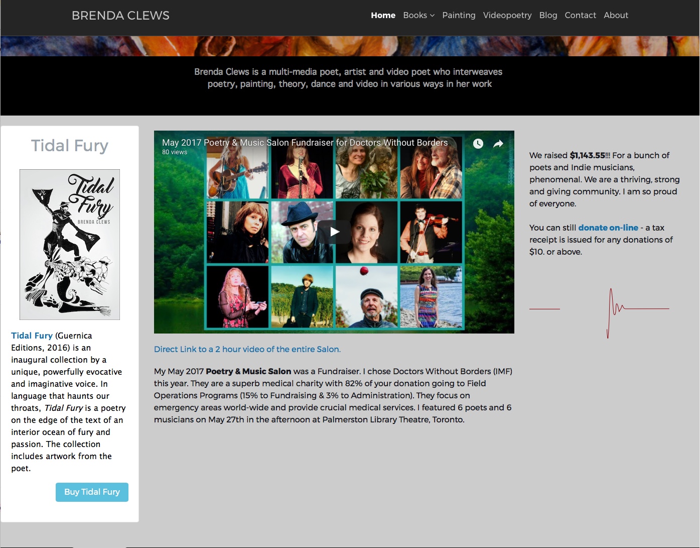
Wow! The page is elegant and refined. I hadn’t understood the power of Margins (though I did the tutorial) until now. THANK YOU so much! The amount of help you give is amazing and I do appreciate this. I agree with you on your Sample Two page. The sidebar and the main content now look fantastic! The alignment is exactly right. Very happy with my Home page (brendaclews.com).
Only question, with the main Foundry stack I use either black or white backgrounds. If I’ve tried white and then switch over, I find even with setting the Foundry stack’s colour, I have to change every stack as well. Maybe it’s because I do this too often and once you change a container’s background (et al) you have to keep changing it. Is there a way to return to the default settings of every stack when changing the background colour of a whole page? Or should one re-install every stack & leave the background setting alone? (If the latter, I don’t mind since it would be one-time only and my site is still under construction.)
…I have to change every stack as well…
If you’ve set a background color on a stack, then you would need to turn that off, otherwise you would need to match it to your Site Background color. The Foundry Control Center can’t turn the background color settings off for you though, you’ll have to do that in each stack. My suggestion would be to turn the colored background off on your stacks unless you’re trying to make one particular thing stand out. There’s not a need to redo anything, just toggle the background color picker off on each of your stacks that you’ve set a color on.
Wow! The page is elegant and refined. I hadn’t understood the power of Margins (though I did the tutorial) until now. THANK YOU so much! The amount of help you give is amazing and I do appreciate this. I agree with you on your Sample Two page. The sidebar and the main content now look fantastic! The alignment is exactly right. Very happy with my Home page (brendaclews.com1).
Glad you like the outcome. I think it was just the name of that stack that was tripping you up is all. Have a nice weekend!
Can I suggest Foundry’s Glide stack. You don’t need to have any nav items, just nav content enabled. You do have to have at least one Glide Nav Section as a container for your page content.
I use it as the base stack for most of my pages, but not always for on-page navigation
The advantage is that whatever you have in the nav content “sidebar” area will scroll with the page so that it remains visible.
The disadvantage is that Glide doesn’t display on mobiles.
While I see where you’re going with this @Phloque I can’t recommend it. In adding the Glide Navigation stack to the page, but not using its navigation elements you’re still including all of the CSS and javascript for the Glide Navigation. And when it comes down to it, the Glide navigation uses the same exact method for its layout as the Columns stack. With your example though you’re also throwing in a lot of unnecessary code on the page that you’re not using. And on top of that the navigation column in the Glide Navigation stack does indeed get hidden at the mobile breakpoint, so you have no choice but to have your “sidebar content” hidden there, unlike if you use the Columns stack as you should.
I would not recommend using the Glide Navigation stack for this purpose. Trust me – use the Columns stack. That is one of the main things it is built for.