I have an issue with the site I currently design for my wife > click <
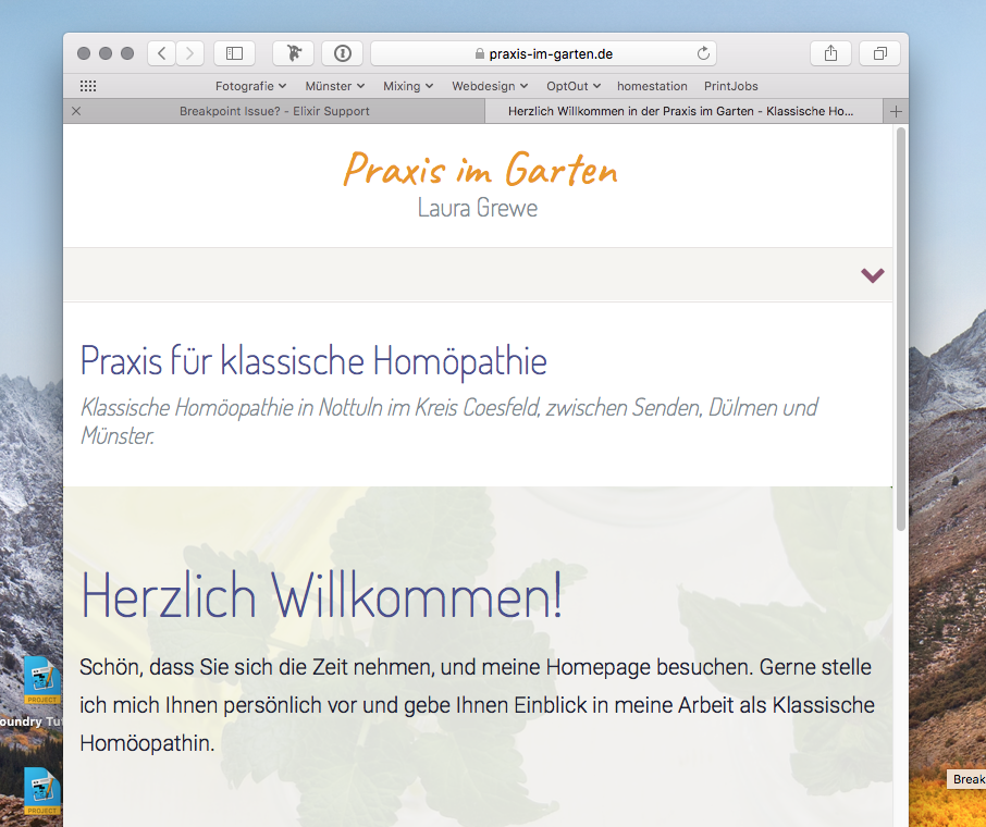
It all looks good on all devices when I check it within Safari’s Responsive Design Mode. However, looking at the site on portrait view on my iPad, I get something like this:
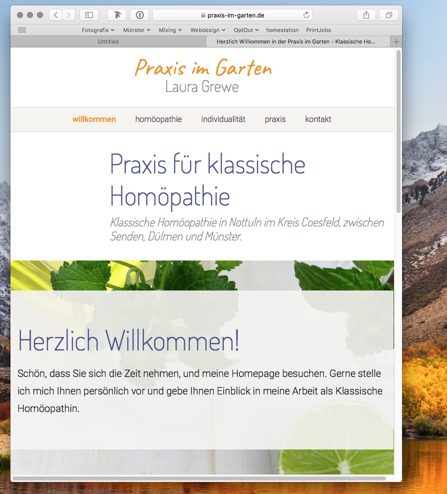
But it should be looking like this:
You notice a moment, when you decrease the width of the Safari window, when that happens. Just for a few pixels. Am I doing something wrong, and can I resolve that?
Cheers,
Darian
Hi there @pumpkin – Can you send me a ZIP file containing your project file so that I might have a look at it?
It looks like you’re using the show / hide features that come built-in to Stacks (Screen Shot 2018-03-22 at 11.15.23 AM.png • Droplr). These use a slightly different breakpoint than the Foundry breakpoints. Foundry includes the Visibility stack because of this. You’ll want to use it to show / hide your image instead.
That said, you’re hiding the image at the Tablet view, but still have a left-hand column that is 3 units wide at the tablet breakpoint. You’ll want to make sure your image is visible at the tablet breakpoint or set your columns up to display differently at the tablet breakpoint and add in a desktop breakpoint as well.
1 Like
Thanks Adam. Didn’t know that those visibility options differ from the visibility stack. I’ll try and see if I can get it to work properly.
1 Like
And yes, it works!  Thanks again!
Not a problem at all. Glad to help. I’m going to go ahead and mark this one solved.