Webdeersign Project 9 for Foundry is now available

Project 9 is available. This was an interesting build in that it started off as a Foundry Project because I really liked some of the extra features such as the Badge Box, Card deck, Rainbow Bar and progress Bars. However, what really struck me was how easy it is to create a well spaced out and well padded layout without spending a lot of time fine tuning it.

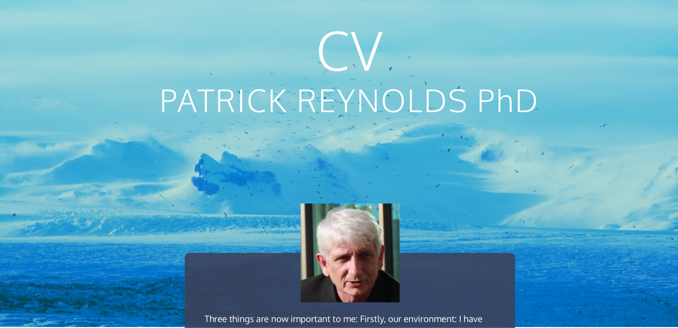
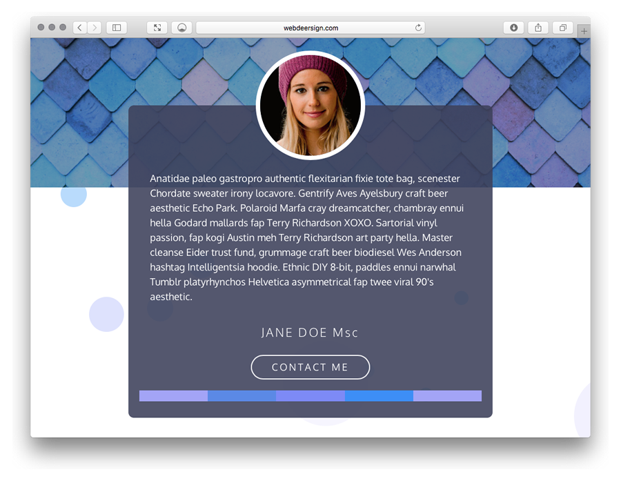
This project is a singe page design suitable for a personal portfolio or CV. For someone who wants to make a statement with a current design CV then this is a powerful looking quick solution.

This project use a few PADDY stacks (included with the Project) and then only SectionsPro and ProStyles from BWD. These are 2 really clever and powerful stacks that everyone should learn how to use. The Project shows how to setup ProStyles to:

  1. Setup multiple background images with blend effects. There are 5 included with project, and one setting changes the Hero BG to help chose the image for this important part of the site.
  2. ProSTyles is used to control the proportional padding between all Sections so by altering one setting you can adjust the entire Sections padding in the page.
  3. Build background effects such as the pseudo parallax effect of the bubble background. Again ProStyles makes this easy to switch between different configurations.

Also there is a Timeline display that can be edited and scaled and as it is text based, the information is searchable. Usually these type of timeline displays are images. The Timeline display layout is supplied in a light and also a dark set of images.

With this Project, you can also learn how to achieve the overlapping of content. The Initial Hero page has an image of the girl overlapping a dark grey box which overlaps the main image. SectionsPro makes this a breeze.

Demo1 is at http://webdeersign.com/pr9demo/pr9demo1/
demo2 is at http://webdeersign.com/pr9demo/pr9demo2/

Which one is Foundry and which is Foundation.? No looking under the hood or reading the footer which gives the game away.

3 Likes

@webdeersign

Hi Gary,

Without looking to the footer first and comparing both I saw that the first one was Foundry but unbelievable how they look so similar, if you haven’t work with Foundry or Foundation before would be difficult to see any difference between the two of them. As always a superb design, would not expect less of you :slight_smile:

Regards

Thanks. The Foundation one was much harder to get the padding right (or nearly right).

2 Likes

Instant buy. Again! Is there a subscription available :slight_smile:

1 Like

Many thanks. I tend to create the Projects when I have some gaps in my normal freelance web work so they don’t appear with much regularity.

1 Like

Looking nice @webdeersign! Liking the color palette of this project file a lot.

1 Like

Thanks. The colour palette came from the main image once the Blend mode with a blue base colour was applied from within RW. It’s a great way to create a colour palette.

2 Likes

So less that 24 hours after releasing Project 9, a customer uses Project 9 to create this perfect front end to their main web site. This is what RapidWeaver, Stacks and our Projects are all about.

2 Likes

Just updated this Project to V1.01 with new higher optimised images and an easier to use round image for the girl image, even though Foundry has the additional function that Foundation doesn’t have, to round images anyway.

When using blend modes, such high quality images are not needed, and so higher levels of image optimisation can be used for the blended image producing a smaller image.

3 Likes

Very nice design. It catches the eye with the use of your colour choice.

2 Likes

Many thanks. Glad you like it. The Style Guide is a big help in choosing the best colour and I also have a trick in that you can use a tall rainbow bar filled with additional colours if you need more. During the design phase you can use the Rainbow bar to show on a screen which can also help to choose the right colour.

1 Like