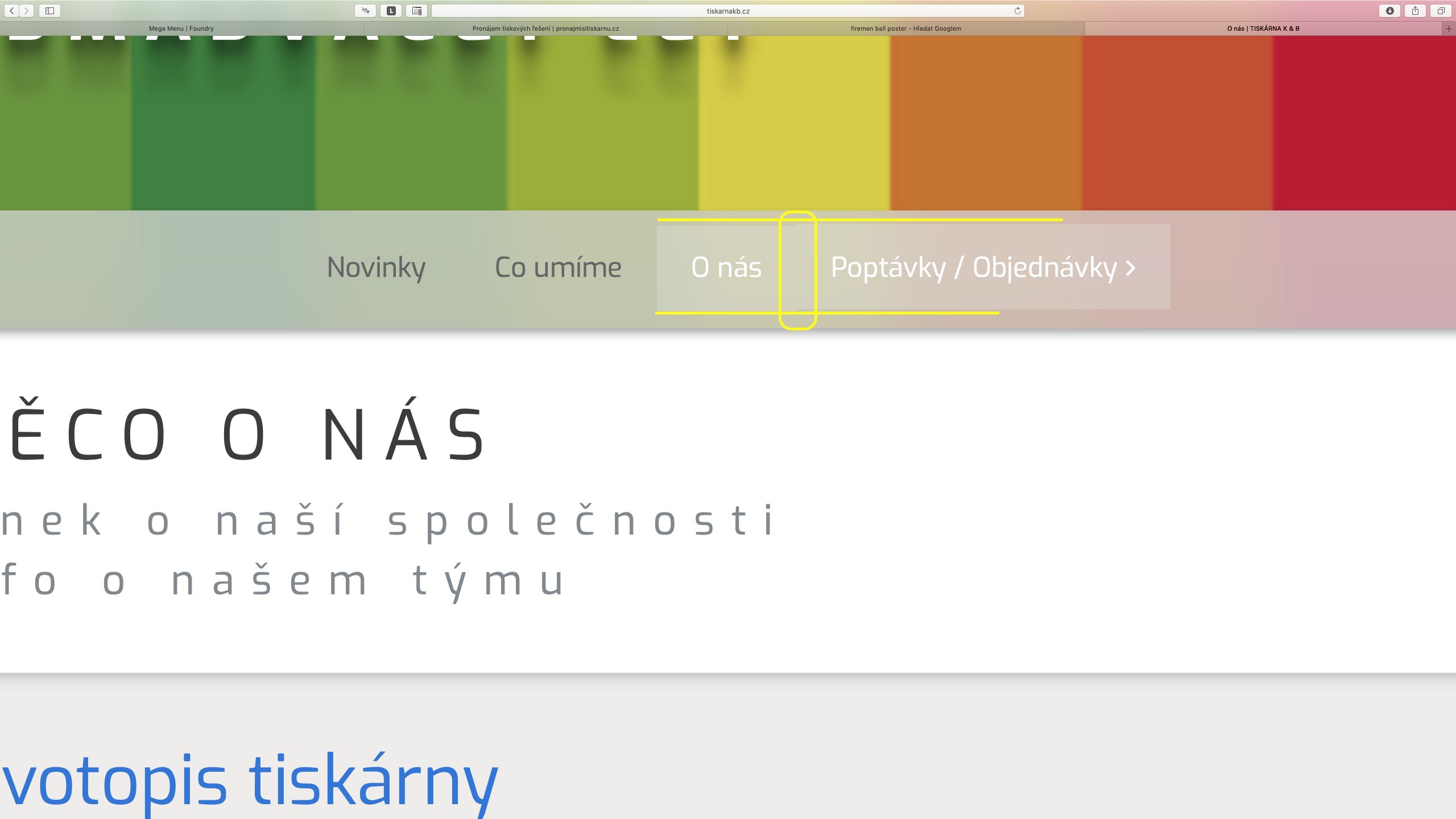
This is a shifting of the background color and the text between the static and the drop-down buttons. It is most visible when the buttons are side by side in MegaMenu.
The space between the elements is due to the way Safari is rounding the spacing distance. This is why you’re seeing the tiny gap there in Safari and not Chrome, as they’re doing the math differently. The alternative was to have the hovered element overlap the currently selected element by one pixel, which was less desirable.
The problem is between “O nas” and “Poptavky / Objednavky”. “Poptavky/Objednavky” is dropdown menu.
Problem is only static menu item and dropdown menu item. Static item and static item is right.