I recently used the Grid stack on a new website. Within each grid item I placed an SVG image/icon. All works fine on computer screens and iPads. But when the screen becomes too narrow (e.g. on my iPod Touch) the SVG images get weirdly smushed. Not just smaller, but also fall outside the grid with some extra space within each grid space. (Hard to describe in words.)
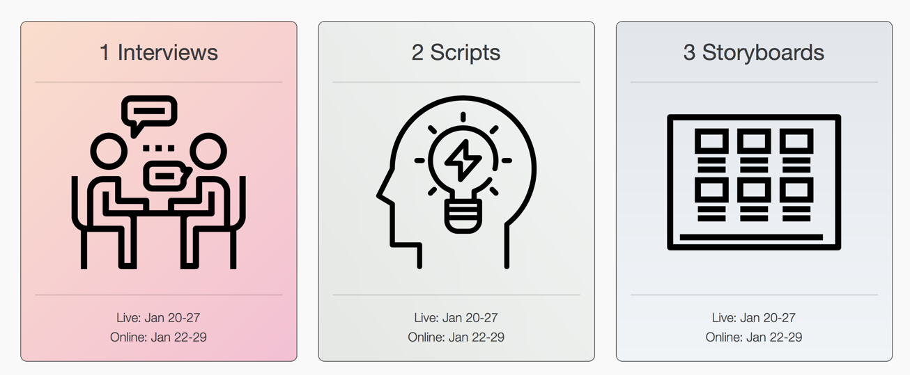
Scroll down a wee bit once you are in the Classes section and you’ll see the grid with SVG icons.
I’m attaching 2 images: grid a regular screen size, grid at much smaller size. Is there anything I can do about this? SVG images are so much crisper than PNG/JPG. So I don’t want to convert. If worse comes to worse I’ll just live with this quirk. But if there is something I can do so the SVGs behave a bit better on small screens then I’m all ears!
There is no doubt that SVG’s are fantastic and we should all be using them where ever possible.
Out of interest how are you displaying SVGs? As you know, Foundry does not support warehousing so does not support the easy and conventional way of using SVG’s. There are however, a load of 3rd party stacks that do offer warehousing. There is the excellent BWD BlueprintSVG stack which will allow you to paste in the SVG code and use in Foundry without the need to warehouse the SVG. I have lost track of what RM did with RW7.5 and we are still waiting for documentation on the “warehousing” resources feature which may or may not be present in RW7.5.
I suspect that your SVGs are set to a dimension and are therefore no scaling. First check out this great resource at How to Scale SVG | CSS-Tricks.
If there is a dimension in the SVGs such as height 200px width 300 then remove that with a text editor. Also you may need to add preserveAspectRatio=“none” to the exact same place where you would find a dimension of just before the viewport dimension. Any questions then read the above.
Unfortunately there are a lot of poorly created SVG’s about which do not adhere to the correct full standards so I suspect this is your main issue here. I have Adobe Fireworks CS5, Illustrator CS5 and Photoshop CS5 which do not even support SVGs!. Day to day I use Autodesk Graphic for SVG creation which I have found to be excellent and better than Affinity Designer.
Bring on the day when SVG’s can be added with ease as foreground and background images in RW.
Ha. As you have found out it is very simple to use a warehoused image.
As a test, try the BWD BlueprintSVG stack which will also allow you to recolour the stroke and fill amongst other things. I suspect you also need to set a max width dimension
The SVG images should scale to whatever size the width is set by the container. They are not scaling in the first image show above.
I have used SVG’s in the Potion Grid without any issues. I have used as conventional warehoused images in SectionsPro as background images and foreground images with BWD BSVG and S4S Graphics stack.
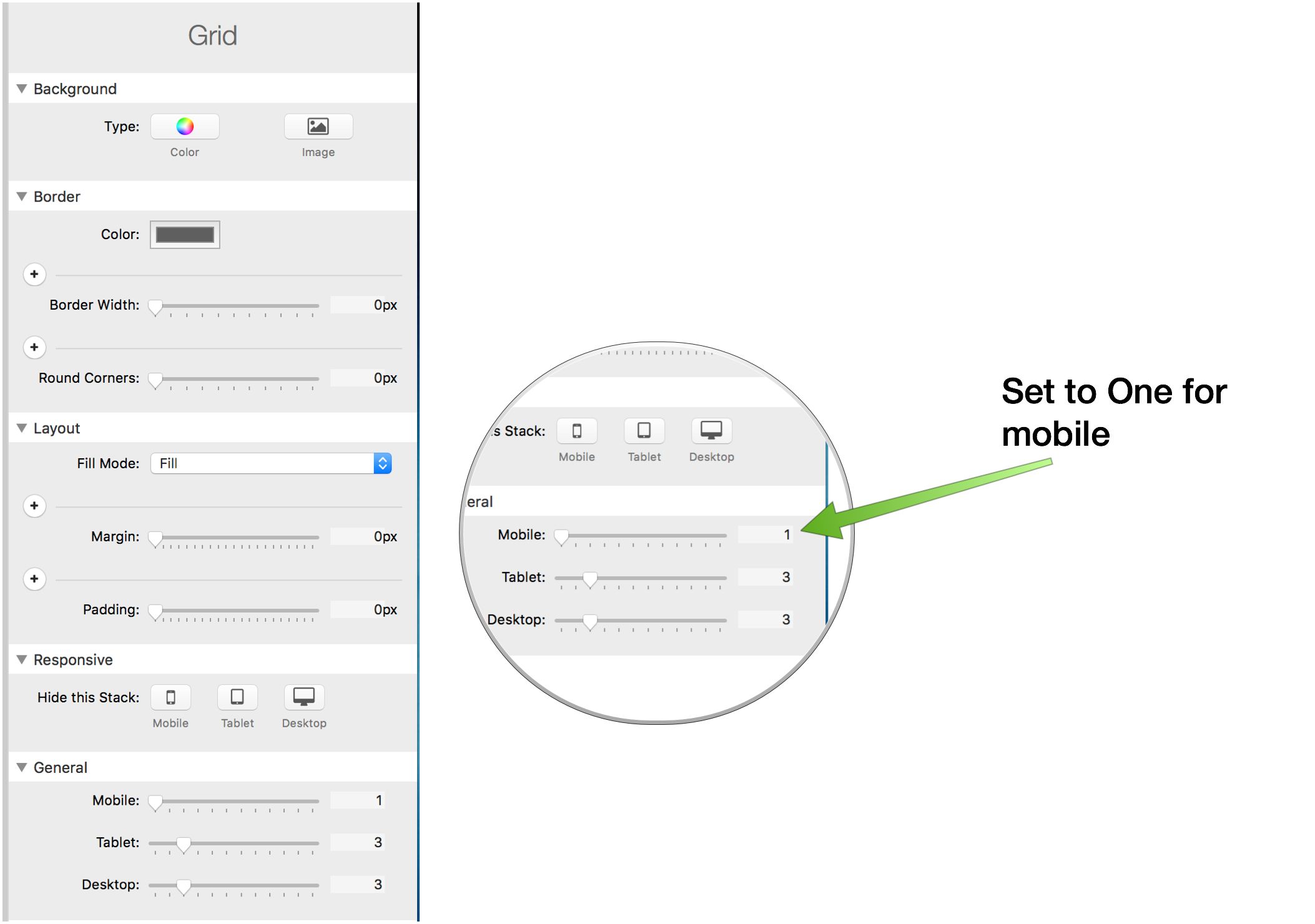
@Steve_J: Unfortunately the problem persists even when I use 1 column only for mobile.
@webdeersign: the Blueprint SVG stack seems to work perfectly for this. It will take me some time (30 min) to do all the conversions and set things correctly, but in the short testing I’ve done this works perfectly. I’m mainly fiddling with what are the best Blueprint settings for the various widths. 90% seems to work great for small and medium. Seems to strangely result in images too big at large and x-large (but still in allotted container) at 90%, so I’ll probably fiddle with 80 or 85 when I get to my office with a bigger monitor. Thanks for the suggestion.
SVGs open nicely in Espresso, so the copy/paste of code was easy enough. This will be a super handy stack for some other projects I’m working on.
However, I think S4S Graphics stack would be easier to use as you already have the images in a server folder.
I was curious as to why this wasn’t working for you and built a simple demo file with a 3 column Grid with a BlueprintSVG in position 1, Graphics stack on 2 and a HTML stack with your code in 3. Below is a video and they all behave perfectly and just as expected. Therefore you must be doing something somewhere else that is upsettings things.
Gary: Thanks again. Very interesting. Well I replaced all 9 HTML stacks with the Blueprint SVG stack and it all works perfectly now.
Most of the SVGs were either “silent” on width/height or had been set to 100%. However, there were 2 or 3 of the ones that were very specific: height: 50px, width: 50px. Using Blueprint it was easy to spot this problem and replace with 100%. Then everything worked nicely.
I was a little surprised there was so much variation in declared height/width, but now that I know I just may always use Blueprint SVG as it makes those issues transparent. I believe the SVG you used in your example happened to be one of SVGs set at 100/100 percent.
SVGs shouldn’t really have a width and height and if they don’t then a 100% width and 100% height is used. Sometimes you need the keep aspect ratio declaration to maintain the shape.