Yep that’s correct. I have placed the anchor just like you’ve said…above that paragraph.
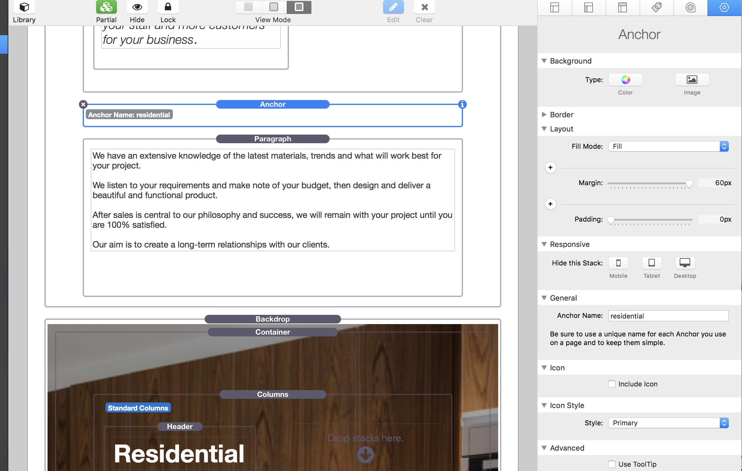
If I place it at the bottom of that container or between the 2 containers then it opens the anchor link halfway down the section with ether Residential heading instead of above it.
Ah sorry, i didn’t read through the earlier screenshots. I sort of wonder if it has something to do with the Backdrop stack? That’s just speculation, though, I’m not at my RW computer to play around with placement.
If you post your project file I can take a look at it. HTML anchors though are exact locations. The only other thing I can think is that since your pages seem to load pretty slow most times that perhaps an image is loading afterwards and changing where things are located. That said, if you post your project file I will publish a test to my server here. If you post it soon I can do it today, else I will have to do it tomorrow as I have to leave the office soon.
I have published a test here (using the correct folder and filename structure), and tested it. It seems to be working fine here. I have placed these three anchors at the appropriate starts of their respective sections, and it seems to be working fine:
I’m not sure why you had the anchors in odd locations, but I would not place them in columns, and other odd locations myself. You could compensate for the sticky navigation by adding more padding to the top and bottom of your Backdrop stacks if you like. That is up to you and how you wish to handle it.
EDIT: Now that I’ve tested and then posted this it seems to be now be doing the skipping up the page a bit here too. I suspect it is something on your page either loading late or a script or something possibly causing it, but I don’t have the extra time right this minute to troubleshoot your whole page unfortunately as I’m headed out the door soon.
Yes they are skipping down the page as they were for me.
I only placed the anchors up in the column above only to try and see if it helped with the place it opens…but it doesn’t help a great deal.
I originally had the anchors just above the section I wanted them to open but they don’t open where I place them. In each respective one it opens further and further down…like you said skipping down.
Personally I would rebuild the page as simple as possible. Create the sections of content and build it out without the slideshows, and such. Just basic sections and make sure it is working for you that way. Then start adding things back in and see how it goes. As you test along the way if you hit the same problem again you’ll know that something you’ve added to the page will be causing your problem. This is what I would do to troubleshoot the page myself. Either that or work backwards removing no intensive things (large images, sliders, etc, etc), testing as I go.
I’ve realised I responded to your email by hitting the email reply but it was a “noreply” address so you probably didn’t get it.
So, sorry about the delay in getting back to you.
I did as you suggested and took out a few things.
Started with the floating Mini-Navigation stack with social links and also the Slider gallery in a few containers and that did the job.
I think it was the gallery, the images were not large but there were 3 sets of galleries with 4 images in each.
It all looks good now and the Anchor link is going to correct spot, though it’s a shame I needed to remove those elements.
Thanks for your help.
But now I have some other questions and requests…sorry mate.
A Float stack for Foundry?? I want to have text flow around an image but there doesn’t seem to be a Float stack in Foundry and when I use the normal Float stacks, like your Float or BetterFloat I can’t set the font to what I’m using to match the rest of the site…it defaults to Helvetica I think.
If you’re going to do a Float stack for Foundry can I make a request please…CutOut Stack by Stacks4Stacks allows a very nice way to have a circular image with text floating around it. I’d use this but same issue I can’t set the font styling to match the rest of the site.
Now that you have me font selection…your Foundry Bulleted List stack. I’d like to be able to select the font for this stack, it also seems to go to a default font. Plus another request please, I’d like to be able to increase the padding between the lines for this stack…they are a bit too tight, I’d like to be able to select padding space between each line.
Same thing for the Foundry Table Stack, I’d like to be able to set my font to match the rest of my site.
I hope these are not asking too much…sorry…you probably regret me getting Foundry!! All I want is updates and help from you.
A float style stack is on my todo list already. I don’t know about a circular wrap around text though.
You can set your Base Font in the Foundry Control Center stack and it should be applied to the entire site, event 3rd-party stacks that are not Foundry based (as long as they’re not setting their own fonts).
They should be using the Foundry line spacing from the rest of the site in order to create a constant flow of the same line-height multiplier and keep things uniform feeling. If you’re seeing a case where they are not the same line-heights as the other text on the page, please send me a ZIP file containing your project file and point out a specific example.