Hi @Monica – The logo sizes itself to match the available space, height-wise, within the Navigation Bar. The taller the Navigation Bar, the taller the logo. Also, check your image to make sure you have as little empty space around it as possible. This will help as well. If you want to post a URL or just your image file I can take a quick look.
@elixirgraphics, Thank You Adam, now I remembered that I needed to get rid of the extra space around the logo (I did) but still the logo need to be a little larger, I also changed the high to max (80).
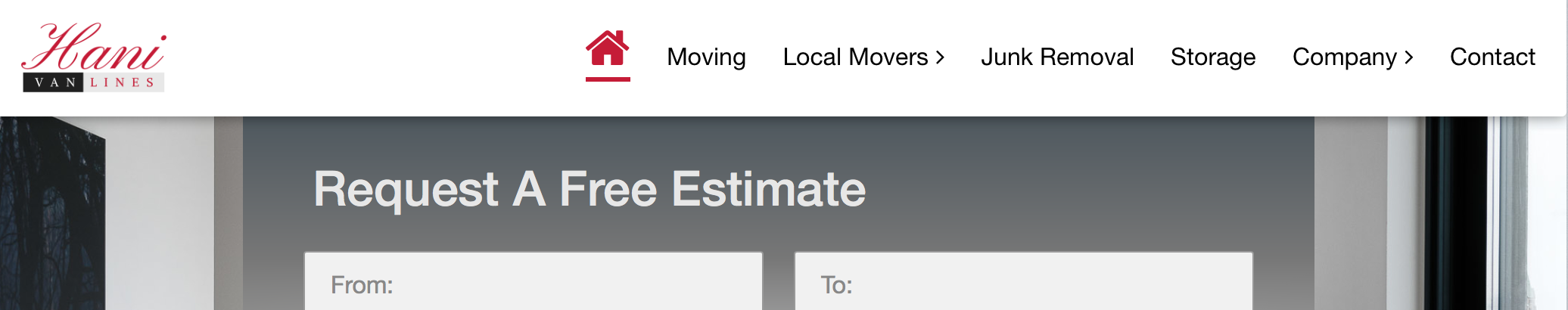
Here you are the URL: http://www.hanivanlines.ca/
On another topic, I am still also having issues with SuperForms in all pages (1st page form it has a re-direct) 1st it was PHP problem, Then once we hit the submit, nothing happens no email received, I am hoping if anyone has the same issue to let me know the solution. Thanks
in my opinion the core problem is the max height of only 80px (minus white space the logo can have a max height of only +/– 60px). simply not enough for certain logos!
In those cases I suggest to use the nav bar without branding and inserting the logo in a separate stack (which means a lot of additional work to fine tune for different screen sizes)
I would love to see increasing max height for the nav bar stack in the future. any plans on that, @elixirgraphics?
separate settings for positioning the logo would also be nice
for the client it´s always bad news to hear that the logo in the navigation bar is already at max size. and modifying the logo in order to generate a more or less „icon-ized" version of the logo might scare off the client…
@elixirgraphics I have been trying a few ideas with logos and notice that there is some miss alignment of the image and loss of the lower part of the logo most noticeable on large square logos.
It appears to be caused by display: flex-item; in .branding_logo img and if it is set to display: flex; the logo is displayed correctly.
Update. The above works for square images larger than the nav bar height but when logos images are less than the height of the nav bar, they align at the top instead of center. Something is overriding the vertical image centering.
Not a problem. Looking nice. More intricate logos, I feel, sometimes need placement in areas besides the navigation bar area of a site. Areas like the banner or elsewhere often serve to allow you to showcase a logo better.
On another topic, I am still also having issues with SuperForms in all pages (1st page form it has a re-direct) 1st it was PHP problem, Then once we hit the submit, nothing happens no email received, I am hoping if anyone has the same issue to let me know the solution. Thanks
I am not familiar with SuperForms. This might be something that you’ll want to contatc the SuperForms developer about.
At what height do you think would be enough? I ask because at some point you’re making the Navigation Bar excessively large just to display a logo image bigger. This seems like wasted space to do that, IMHO, when you could insert the logo into your Banner, or a column or elsewhere where the logo will automatically get more attention. Then you could place a silhouetted logo, or an alternate logo in the Navigation Bar, or opt to omit the logo from the Navigation Bar even. Just some thoughts. I am curious though as to what would be your ideal max height for the Navigation Bar.
separate settings for positioning the logo would also be nice
In your second screenshot you seem to have extra spacing below the image, but not above it. Hard to tell anything from just the screenshots though, so that project file will help out.
@elixirgraphics: thank you for your response.
your suggestions are exactly what I have been using as a workarround. but it is of course less comfortable, compared to the automatic resizing when the logo is placed within the nav bar stack.
to give room for almost any kind of logo (+slogan, +surrounding white space, +whatever…) I would suggest 120px minimum. if it makes no difference for you as a developer - why not be generous and set it to an even higher value…? let´s say 200 or even 400px… The option to set a higher max height does not mean the user is forced to do it…
Seeing that the resolution of displays is increasing tremendously and will further increase - 400px isn´t as much as it sounds.
regarding the positioning:
since it is always nice to align logo and the text of the actual navigation menu I would love to fine tune especially the vertical alignment of the logo. some logos align perfectly when they are vertically centered, but others need some shift upwards or downwards.
currently I edit the logo in photoshop to add / remove some white space left/right/top or bottom until I achieve the „perfect alignment" with the navigation text – it would be helpful to manage that directly within RW, if it is easy to implement such a feature
I’d also like to see the max height of the Navigation Bar increased.
In addition, I’d also like to see the min height decreased. In some designs, I’ve preferred a thinner nav bar. I’ve used 35px before. As long as there isn’t clickable content above/ below, there doesn’t seem to be an issue with it still being easily clicked on mobile devices.
With your sensible defaults, I don’t see any reasons not to give us a bit more control in both directions.
if it makes no difference for you as a developer - why not be generous and set it to an even higher value…? let´s say 200 or even 400px…
It does indeed mean a lot to me. I try to set things within the norms or what people should be using. A 400 px tall Navigation Bar is not that though. This is what 400 px looks like height-wise:
That is an unrealistic navigation bar height. This verges on a banner, and not a Navigation Bar. While 200px is better, it too is pretty big as far as Navigation Bars go.
I could see upping the max to maybe 120 px. But I will take a look and see how that plays out and looks on a page with other elements.
The option to set a higher max height does not mean the user is forced to do it…
This is true, but why make a modification that isn’t going to be used. No one should really be using a Navigation bar this big. It is one of those cases where if you’re doing this, you might as well be using a logo in the Banner instead. It will look less awkward.
since it is always nice to align logo and the text of the actual navigation menu I would love to fine tune especially the vertical alignment of the logo.
Honestly this is easier done by adding a small amount of empty space in your image to adjust its positioning. The number of controls that would have to be implemented would add a lot of extra Stacks variables to the stack. With each added Stacks variable you increase the processing time in Edit Mode and slow things down.
I agree that a navy bar which contains only text looks strange in those sizes. The need (or actual the wish) to have more flexibility is tied to the question how exactly the given logo is designed. And how you want to align it vertically to the text.
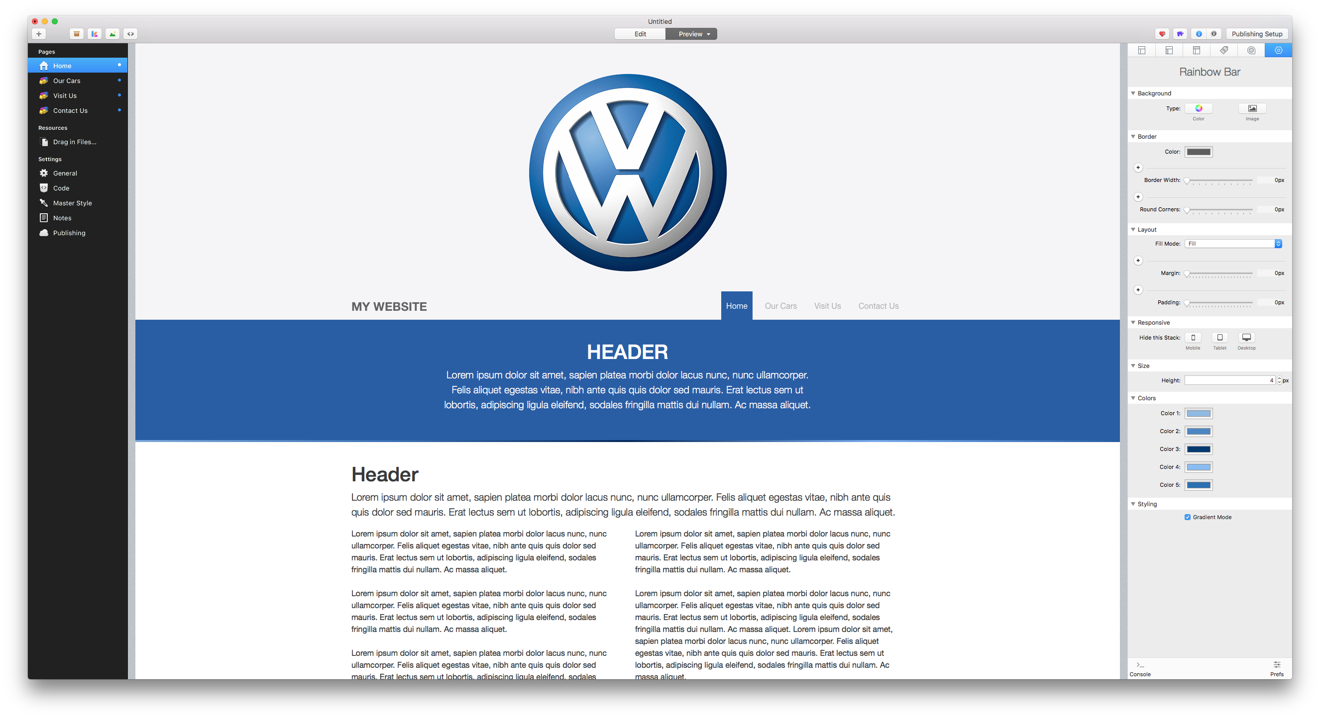
Just as a (over exaggerated) example - Imagine this: The VW Logo/Signet. Below that: the logotype (“Volkswagen”) followed by a horizontal divider. Below that a Slogan/claim.
That would make up a very tall logo which needs a lot of space if you e.g. Want to align the divider with the navigation text.
I am aware that I totally ignore the workload that comes with modifying stacks settings - just because I have not the slightest clue
A taller nav bar with transparent background placed on top of a huge background image would not appear that bulky as it appears in the screenshots…
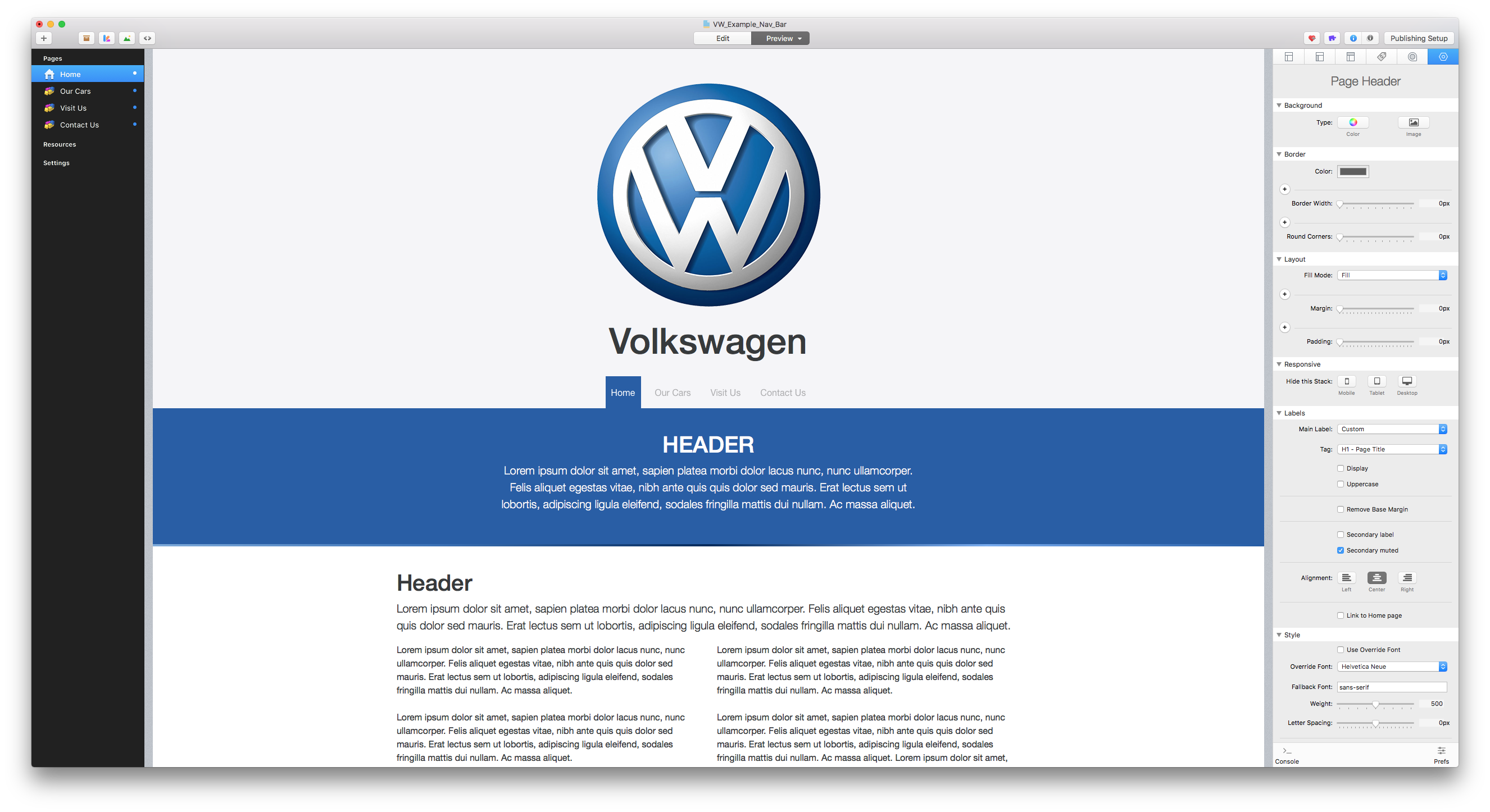
If I understand what you’re saying, then you don’t need to make the Navigation Bar that tall. You only need it as tall as your text. The below example uses the 55px height for the Navigation Bar:
Your response may generate quite a lot of feedback. I was content to just read everyone else’s comments and learn what I could from them. However, your latest response prompted me to chime in.
Never underestimate the creativity of those who use Rapidweaver or the Foundry suite. There may be many reasons for someone wanting a high navigation bar. From what I’m reading, it appears that many people are after something which doesn’t seem to be possible using their current tools, and are seeking a workaround to make it work. Hence a large nav bar to begin with.
If I may summarize: People are looking for a way to initially display a large logo so that their branding is memorable. Who wouldn’t want this? Once the browser begins to scroll downward, they want the branding to be visible, but less prominent. This would require an initially high nav bar to shrink to a minimum height, using a fancy animation which is literally all over the web on site after site, with many developers providing code which would allow this to happen (http://callmenick.com/post/animated-resizing-header-on-scroll). The logo would shrink at the same time and place itself in a muted way off in the top corner, proportionate in size to the new nav bar height.
If this is what was being looked for in the above posts then I did not get that sense. That being said this sort of setup would likely be its own separate stack – a specialized navigation bar for that unique purpose.
I looked back over the previous posts and realized that I was reading into their questions more than they said. The reason for that is because I was searching this question (Logo Larger) for a workaround for a variable size nav bar which would in turn shrink the logo down. Judging by the “likes” to my post, others are searching for a similar solution.
The reason I was doing that, is because another post which was addressed/answered seemed to not fully grasp what the asker was asking, and it had to do with a shrinking logo while scrolling. That post was here: Complicated Menu- Can this be done?
I think that I combined these two questions into one issue and that’s why I read more than was stated and thought I was addressing the other question.
All of that said, I cannot conceive of a way to implement your idea to use a separate stack to accomplish a shrinking logo when scrolling. Is there an example of someone doing this? Could you enlighten us, please? Thanks very much.
 that I needed to get rid of the extra space around the logo (I did) but still the logo need to be a little larger, I also changed the high to max (80).