Hello Adam,
Might you consider adding the ability to use Card List Group items as links?
Thank You.
P.S.: I am doing this now (with many linked lists of individual items, adding dividers in-between)
Hello Adam,
Might you consider adding the ability to use Card List Group items as links?
Thank You.
P.S.: I am doing this now (with many linked lists of individual items, adding dividers in-between)
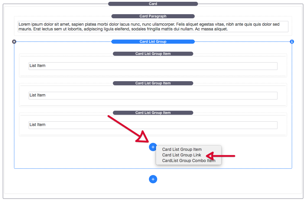
You’re already able to do this with the List Group within a Card, like so:
Click the Blue Plus (+) Button within the List Group that you add to the Card. Then select Card List Group Link. 
Got it! Thank you. Exactly what I need.
Thank You again.
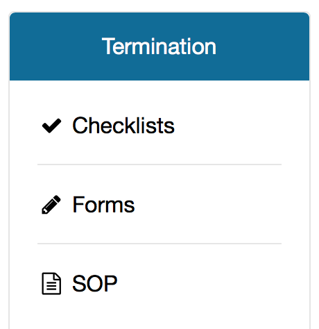
Can I flush the top item with the bottom of the card header or otherwise control the vertical space there?
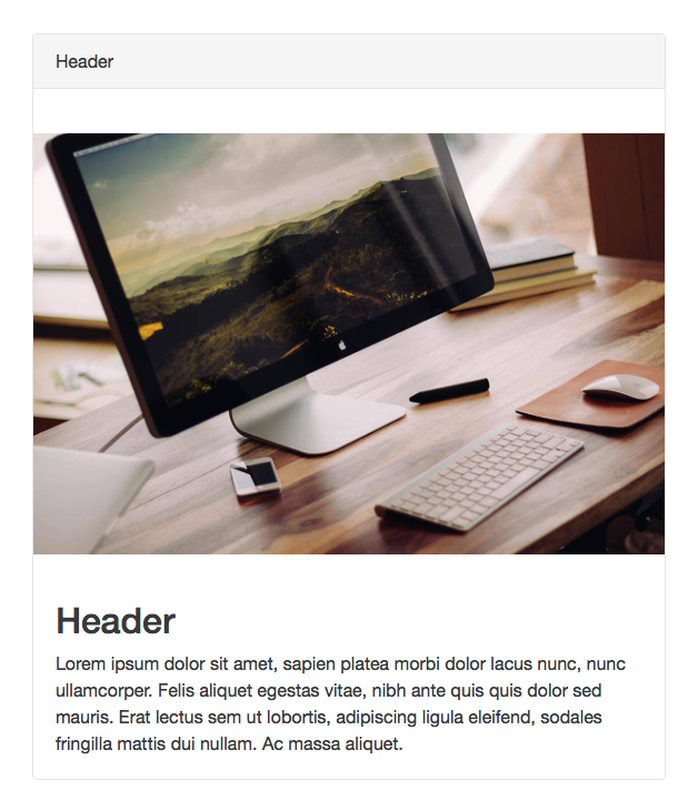
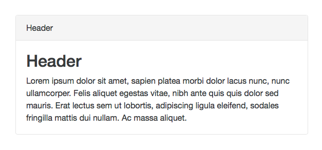
No, sorry, there is spacing above and below the List Group as to set it off from other content in the Card. This happens with all content within the Card. You can see what I mean here with just a Title and Paragraph for example:
Same with an image as well:
I see.
Perhaps it may be worth adding the option to remove either or both top/bottom borders?
The separation is much less defined in your examples as there are no borders there.
Just an idea . . . .
With the way the Card stack is setup to be a modular element, it is tough to gauge exactly how each user will use it, so some of the layout had to be generic, grouping each of the elements in a card-block. Doing so gives it that spacing.
I can look into whether it is possible to make it optional and not mess everything else up in the process. I’m not sure that is will be, but I have added it to my todo list.
The more I look at it, the more I realize that my personal preference (and not necessarily anyone else’s) would be not to address the space - which works nicely in most every case (maybe less so with an image that has a hard edge), but, rather optionally removing the top and bottom lines for this particular stack, or any that may employ such a separator (see mock-up in previous post).
Thank you for your consideration.