I have a page which is using 2 columns. In one column is a sticky content stack. The other column mainly uses the Ivy accordion stack.
All works fine in general. On my iPod Touch the sticky column is not visible: which is exactly what I want. Desktop is fine. But on my iPad Air 2 a funny thing happens. Horizontal orientation is fine, but in vertical orientation the sticky content stack is hidden (which is fine) but the column it’s in is not. So it looks like I have a lot of extra white space on the page. Ideally in this particularly orientation I’d see 2 columns. But seeing one column only without the extra white space would be fine too. Columns for mobile are set to 12 each, for iPad and Desktop to 4 (col 1) and 8 (col 2).
When I check with Safari in responsive design mode it shows all the options will work just fine. But, in practice, this one situation does not work correctly: iPad in vertical orientation.
Here’s a relevant page:
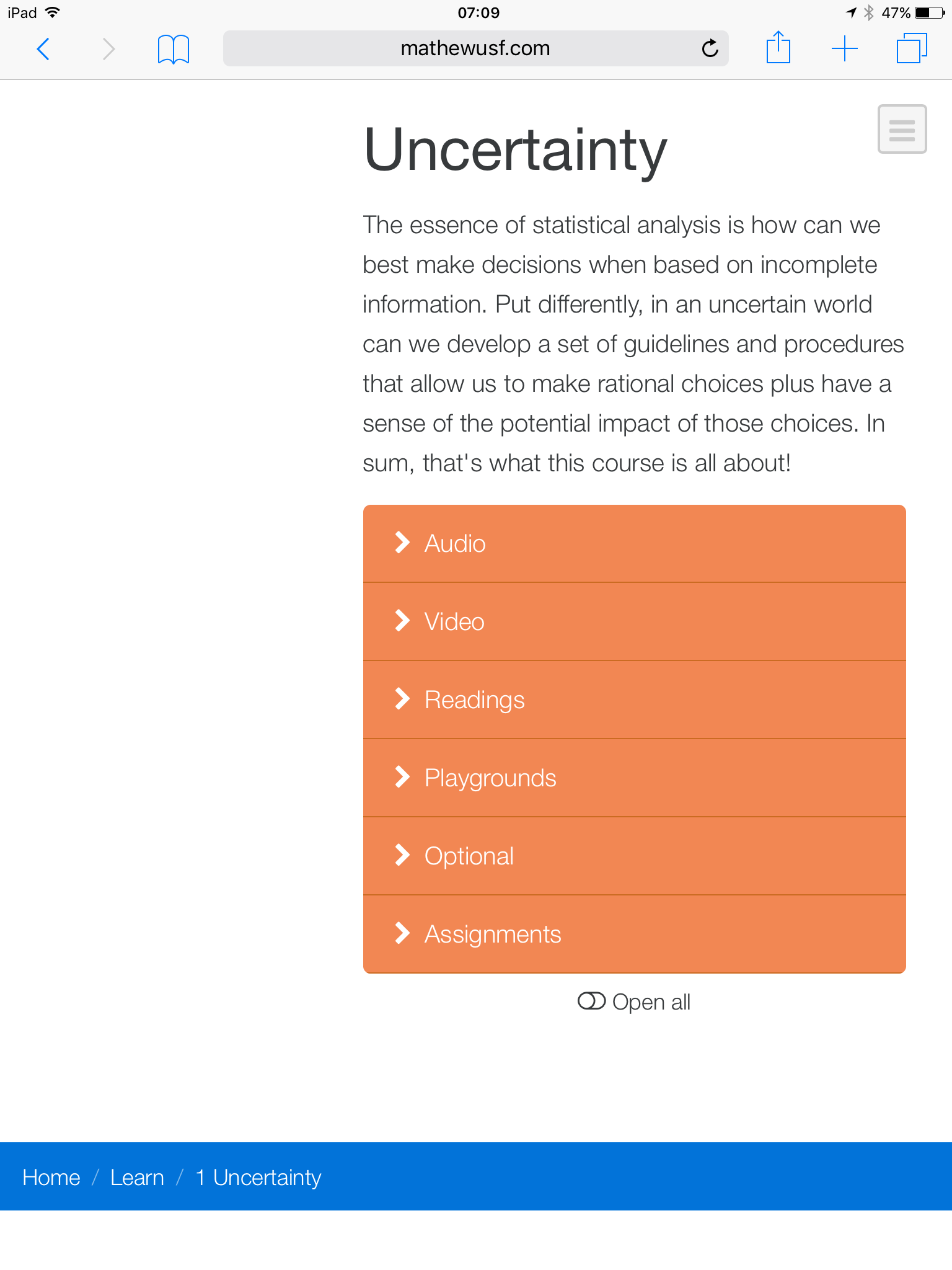
http://mathewusf.com/statistics/learn/1/
The other content on the page is just filler right now. Any ideas about what’s happening and how to fix? (Admittedly most people won’t use iPad in portrait mode for looking at these pages, but it still bugs me.)
I’ve also uploaded a screenshot of what it looks like for me in this one orientation:
I won’t be able to look at this tonight. I may be able to look at it tomorrow, but with the holiday weekend spilling over into Monday and Tuesday my chances to troubleshoot might be limited. That being said, as usual, if you can provide me with a ZIP file containing your project file this will allow me to do that troubleshooting much more easily.
If you’re using any non-Foundry stacks on the page (that I don’t make) you’ll need to get those to me for testing purposes as well. If you’re using just Foundry (and Elixi)r stacks you can post a Dropbox link here. If you need to send me a ZIP file with other items for testing be sure you email me the ZIP file instead.
Adam,
I sent you an email with download link to support at elixirgraphics dot com. I hope that’s the correct email.
Best,
Mathew
1 Like
First thing to note when we’re talking about breakpoints in Foundry – iPad Landscape is the same as Desktop. The width of an iPad’s display in most cases is around 1024 px when in landscape mode, which is the low end of most desktop displays nowadays. So when we talk about iPad breakpoints we’ll be talking about iPad Portrait as that is what is targeted at the Tablet breakpoint (anything below landscape’s width). So you want to design with that in mind.
Do you want the sticky content column displayed on the iPad (portrait orientation)? If so we have to make the content visible at the Tablet breakpoint and design our columns with that in mind, making them wide enough for said content at the Tablet breakpoint (in portrait orientation). If we don’t want it displayed in that portrait orientation then we need to hide the content at the Tablet breakpoint and set our columns up to reflect that. This is likely what you want, I think.
So what we’ll do is this – wrap your smaller column’s content in a Visibility stack and set it to hide the content at the Tablet and Mobile breakpoints. Then we’ll set our Custom Columns (columns 1 and 2) to be 12 units wide. This should net us the following:
- Desktop (including iPad landscape): 2 columns with your content in both visible.
- Tablet (portrait on the iPad) and Mobile: 1 column’s content showing (main content) with the other hidden. Both columns set to 12 units to appear as if the secondary column is hidden.
Hopefully that makes sense. I think I rambled a bit.
Also… as a side note: You’re using Stacks’ built-in responsive show / hide feature for hiding stacks at different breakpoints. I am not sure what those breakpoint widths are specifically off the top of my head, but I want to make sure it is known that they may or may not match up exactly to what the Foundry breakpoints are. Foundry includes a stack for this purpose called the Visibility stack, using the Bootstrap breakpoints to ensure the breakpoint widths are correct. I don’t suspect this is the problem though in this case, but wanted to point it out.
Adam,
Thanks for your very complete explanation. I’ve started using the Visibility stacks and using your recommendations. All works perfectly now! Many thanks.
1 Like
@mitchellm: Glad to help. Also happy that my wordy reply solved the problem.
Adam: The reply may have seemed “wordy” to you, but it wasn’t for me. It’s really useful to know what to do, but also why a particular approach will work better. You were teaching me about the usefulness of visibility, not just giving me a quick how-to. Many thanks for that.
Sure thing! Glad to help. I likely see the stacks differently, too because I’ve used them so much.
If I can get some time I need to record some more video tutorials, too.